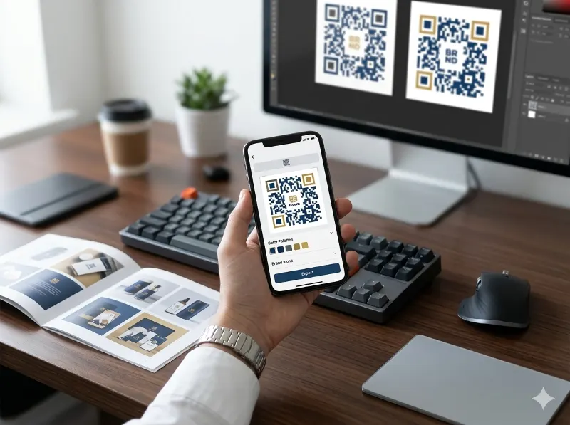
QR Code Design Ideas to Boost Your Brand
QR codes have come a long way from those plain black-and-white squares that used to show up on product packaging and event flyers. Today, businesses of all sizes are using creatively designed QR codes as a genuine branding tool — not just a functional shortcut. If you've been sticking with the default look, you're leaving a real opportunity on the table. In this article, we'll walk through some smart design ideas that can make your QR codes look great and work harder for your brand.
Why QR Code Design Actually Matters
A well-designed QR code does two things at once: it functions reliably and it reinforces your brand every time someone sees it. According to Forbes Advisor, QR code usage has continued to grow steadily in recent years, with consumers increasingly comfortable scanning them in retail, restaurant, and marketing contexts. That means more eyes on your QR code — and more reason to make it look like it belongs to your brand.
Color Contrast: The Rule You Can't Ignore
Before you go wild with color, there's one non-negotiable rule: maintain proper color contrast between the foreground (the dark modules) and the background. QR codes are read by cameras and scanning apps that rely on detecting the difference between the dark and light areas of the code. If that contrast is too low — say, dark gray modules on a medium gray background — scanners will struggle, and users will get frustrated.
The general guidance from QR code accessibility and usability experts is to keep a strong contrast ratio, similar to the WCAG 2.1 accessibility standard that recommends at least a 4.5:1 contrast ratio for readability. While QR scanners aren't reading text, the principle applies — the darker your modules are relative to the background, the more reliably your code will scan. A safe approach is to always keep your modules darker than your background, never the other way around.
Using Color to Reinforce Your Brand Identity
Once you've got contrast covered, color becomes one of your most powerful branding tools. Instead of defaulting to black and white, consider using your brand's primary color for the QR modules. A retail business might use their signature navy blue; a health and wellness brand might lean into a calm sage green. When someone sees your QR code on a business card, a storefront window, or a product label, the colors should feel like a natural extension of your visual identity — not an afterthought.
Here are a few color strategy ideas worth considering:
- Brand color modules on a white or light neutral background — clean, professional, and highly scannable.
- White or light-colored modules on a brand-colored background — great for darker brand palettes, as long as contrast is maintained.
- Gradient or dual-color modules — can look striking in print or digital ads, but always test scannability before publishing.
The key takeaway? Color is a branding asset. Use it intentionally, and test your QR code thoroughly before it goes live.
Adding a Custom Icon: Small Touch, Big Impact
One of the most effective ways to make a QR code feel uniquely yours is to place a custom icon or logo in the center. You've probably seen big brands do this — a recognizable logo sitting right in the middle of the code. It's eye-catching, and it immediately tells the person scanning it who the code belongs to and where it will take them.
This works because QR codes are built with error correction capabilities. The QR code standard supports up to 30% data recovery, meaning a portion of the code can be obscured — by a logo, for instance — and the code can still be read correctly. That said, keep your center icon reasonably sized (typically no more than about 20–25% of the total QR code area) to stay within safe limits. A logo that's too large will break scannability regardless of error correction.
From a branding perspective, a centered icon turns your QR code into a mini billboard. It builds trust, too — users are more likely to scan a code that they can associate with a recognizable brand than a generic black-and-white square with no context.
Don't Overlook Borders and Framing
Another design element that often gets skipped is the border or frame around the QR code. A well-designed border can do a lot — it can give the code a finished, professional appearance, help it stand out against busy backgrounds, and even include a short call-to-action like "Scan Me" or "Get the Menu." These small additions can meaningfully improve scan rates by giving users a prompt to act.
QRSpike.co makes this easy by giving users the ability to add borders directly to their QR codes within the platform. You don't need a separate design tool or a graphic designer to get a polished result — the border options are built right in, so you can customize the look and feel of your code all in one place.
Exporting Your QR Code: Size and Format Matter
Once your QR code design is dialed in, you need to be able to use it across a wide range of applications — from a small icon on a business card to a large-format banner at a trade show. That's where export flexibility becomes critical. A low-resolution PNG that looks fine on a screen can turn into a blurry mess when blown up for print.
QRSpike.co gives users the ability to export their QR codes in various sizes and image formats, so you can get exactly what you need for each use case. Whether you're dropping a QR code into a social media graphic, embedding it in a PDF, or sending it to a printer for a large banner, having the right file format and resolution from the start saves a lot of headaches down the road.
Putting It All Together
Great QR code design isn't complicated, but it does require a little intentionality. Keep your color contrast strong so the code scans reliably every time. Use your brand colors thoughtfully to create a cohesive look. Add a centered logo or icon to build recognition and trust. Finish it off with a clean border and a call-to-action if the placement calls for it. And when you're ready to publish, make sure you're exporting in the right format and size for the job.
If you're looking for a straightforward tool that lets you do all of this without needing a design background, QRSpike.co is worth checking out. It brings together custom colors, center icons, border options, and flexible export settings in one easy-to-use platform — so your QR codes can look as good as the rest of your brand.